Displays the selected icon visually based on the Icon Picker field value.
The icon is rendered directly in your layout, making it ideal for use in feature lists, highlights, or UI elements where visual representation is preferred over text.
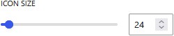
You can customize the icon’s appearance using block editor settings, including size, color, and alignment, allowing it to match your design and integrate seamlessly with other content.