In the free version, the Taxonomy field can be rendered as text. In this mode, the block outputs the selected term value, such as the term name, providing a simple way to display taxonomy information without additional layout or loop controls.
In the PRO version, the Taxonomy field can be rendered as a list, grid, or carousel. When using these display options, the field is treated as a term loop, allowing each selected term to be processed individually, similar to a Query Loop but for taxonomy terms.
Within this term loop, you can insert term-related blocks such as term name, description, or custom content. You can also load and display ACF fields attached to each term, making it possible to build advanced taxonomy-based layouts, such as category showcases, featured term sections, or custom taxonomy listings, directly in the block editor.
Display Options
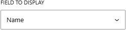
Text
Displays the selected term as formatted text using the term name.
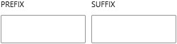
You can optionally turn the term name into a clickable link that points to the term archive. If the field allows multiple values, you can choose how the terms are displayed, either inline with a custom separator or formatted as a list for better readability.
Single Term
PRO
Displays the selected term as a full term object. This option is available when the field is set to a single value.
It allows you to build a custom layout by adding inner blocks that load data from the term, such as the term name, description, or any associated custom fields. This gives you full control over how the term is presented directly within the block editor.
List
PRO
Displays the selected terms as a vertical list.
The field is loaded as a terms loop, allowing you to add inner blocks inside each item to display term data such as name, description, or custom fields. This layout is ideal for simple, structured content like categories or tags, where clarity and readability are the priority.
Grid
PRO
Displays the selected terms in a grid layout.
The field is loaded as a terms loop, and each item can be customized using inner blocks to show term data and custom fields. This layout is useful for creating more visual sections such as category showcases or tag collections, with control over columns and spacing for responsive design.
Carousel
PRO
Displays the selected terms in a horizontal slider.
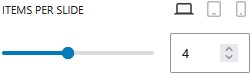
The field is loaded as a terms loop, with each item supporting inner blocks to render term data and custom fields. This layout adds interactivity and is ideal for showcasing terms in a compact space, while allowing users to navigate through items.


