Display Options
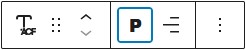
Text
Displays the field value as plain text with flexible formatting options.
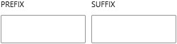
You can customize its appearance using typography settings such as font size, weight, and alignment. It also supports prefix and suffix values, allowing you to add text before or after the field output. The text can be wrapped in different HTML elements, including headings, giving you control over its semantic structure.
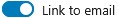
You can optionally turn it into a clickable mailto link, making it useful for simple references or inline links within content.
Button
Displays the email as a clickable button that opens the user’s default email client using a mailto link. This is ideal for calls to action such as “Contact Us” or “Send Email”. The button follows your theme’s styling and can be customized using the block editor’s design settings.
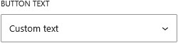
You can control the button label by choosing to display the email address, enter custom text, or load the label dynamically from another field.
