The Gallery field is available only in the PRO version and allows you to display images from an ACF Gallery field as flexible, visual layouts directly inside the block editor.

When a Gallery field is selected, the images are loaded as a collection that can be rendered using different display modes. This makes it easy to present multiple images in a consistent and dynamic way without relying on custom templates or additional gallery blocks.

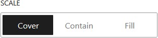
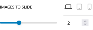
The Gallery field supports grid, carousel, and masonry displays. With these display options, the Gallery field is well suited for portfolios, product galleries, media showcases, or any image-based content where layout flexibility and visual presentation are important, all while remaining fully manageable from the block editor.

Display Options

Displays gallery images in a structured grid layout with consistent columns and spacing.

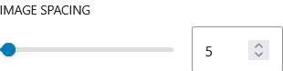
This option is ideal for clean and organized presentations where all images are given equal visual weight. You can control the number of columns and spacing between items, allowing the gallery to adapt across different screen sizes while maintaining a balanced layout.

Displays gallery images in a horizontal slider that users can navigate.

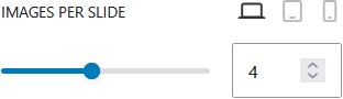
This layout is useful when you want to showcase multiple images without taking up too much space. Users can scroll or click through the images, making it ideal for featured content, portfolios, or highlights. It adds interactivity while keeping the layout compact.

Displays gallery images in a dynamic layout based on their original proportions.

Instead of forcing images into equal heights, this option arranges them naturally, creating a more visually engaging and organic layout. It works well for galleries with mixed image sizes, giving a modern and less rigid appearance compared to a standard grid.

Customization

General Setting

On click action

Choose what happens when a gallery image is clicked. Available actions include doing nothing, opening the image in a lightbox, or viewing the full-size image in the same or a new tab.

Duotone

Apply a duotone or filter effect to the image.

Aspect ratio

Set the image aspect ratio.

Resolution

Choose the image resolution to display.

Empty Message

Display a message when the field is empty.

Display as Grid (PRO)

Column Count

Define the number of columns for the gallery grid.

Image spacing

Set the spacing between images.

Scale

Control how the image fits inside its container.
Cover: Fills the container while maintaining aspect ratio. Parts of the image may be cropped.
Contain: Fits the entire image inside the container without cropping.
Fill: Stretches the image to fill the container, ignoring aspect ratio.

Display as Carousel (PRO)

Images per slide

Set the number of images displayed per slide in the carousel.
You can define different values for desktop, tablet, and mobile devices.

Effect

Choose how the carousel transitions between items.
Slide: Moves items one slide at a time with a sliding animation.
Scroll: Scrolls items continuously across the carousel.

Direction

Choose the sliding direction of the carousel. Available when autoplay is active.

Slides interval

Set the time between slide transitions.

Available if effect is set to slide.

Images to slide

Set how many images move per slide.

Available if effect is set to slide.

Pause on hover

Pause the carousel when hovered. Available when autoplay is active.

Available if effect is set to slide.

Scrolling speed

Set how fast the carousel scrolls.

Available if effect is set to scroll.

Scale

Control how the image fits inside its container.
Cover: Fills the container while maintaining aspect ratio. Parts of the image may be cropped.
Contain: Fits the entire image inside the container without cropping.
Fill: Stretches the image to fill the container, ignoring aspect ratio.

Display as Masonry (PRO)

Column Count

Define the number of columns for the gallery grid.

Image spacing

Set the spacing between images.